
How to Choose Flag Colors That Match Your Corporate Branding
For branded flag printing, matching corporate colours begins with a defined reference and ends with an agreed appearance on the selected fabric. A phone screen is not a reliable colour standard. Give the print supplier your approved colour specifications, explain which colours are critical and discuss sampling before production. Consistency is easier to manage when the comparison method is agreed in advance.
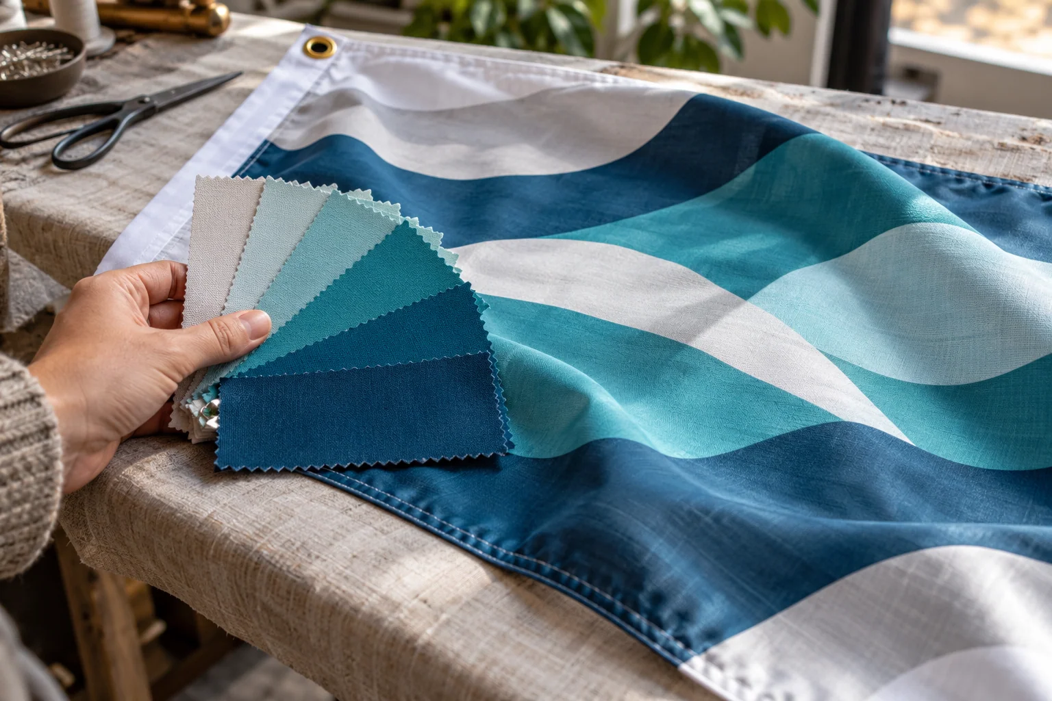
Name the intended reference
Provide the brand manual and identify the current approved palette. If you have a physical master sample, describe what it represents and how old it is. A faded outdoor flag should not automatically become the colour standard for a new order. Include the preferred background and logo version, because a symbol prepared for a light field may look different against a darker fabric design.
Understand the viewing difference
Screen colour and printed textile colour are presented in different ways. Adobe explains that colour management translates colour through profiles rather than making every device identical. Ask the supplier which file preparation workflow is appropriate for the actual output process. Avoid repeated casual RGB-to-CMYK conversions by several people; maintain the original artwork and let the agreed production workflow handle the necessary conversion.
Assess the selected textile
The appearance of a colour is affected by the surface on which it is printed. Mimaki shows that polyester fabric textures can produce different expressions from the same data. Review a sample on the proposed fabric rather than relying on an unrelated glossy paper print. A translucent flag viewed with light behind it can also look different from the same design against a solid wall.
Agree what approval means
Choose who will sign off the colour and how the sample will be viewed. Compare the most important logo colours under consistent, reasonable lighting. If an exact specification cannot be reproduced with the chosen process, ask for the available alternative before approving the order. Do not describe a screen approval as a measured colour tolerance unless a separate documented acceptance method has been agreed.
Keep a repeat-order record
Retain the approved physical reference where available, plus the final artwork, material specification and date. If a later order changes fabric, print construction or supplier, review the colour again. Send Orient Uniforms FZE the SKU and reference details with your enquiry. Treat matching across flags, garments, patches and rigid signage as a coordinated sampling task, since those products can use different materials and production processes.
Questions & answers
Will an RGB value print exactly as it looks on my phone?
That should not be assumed. The phone, its settings and the print process affect appearance. Use an approved reference and discuss a sample for important brand colours.
Can one sample approve every product material?
A sample is most useful for the material and process it represents. Review changes across different textiles or products instead of assuming one approval covers every surface.